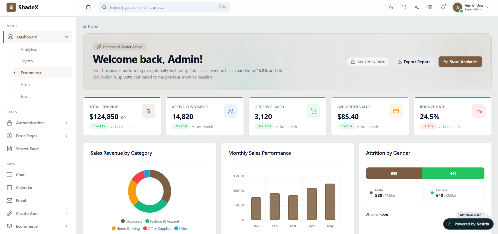
 Actual ShadeX Admin layout options interface screenshot — click to explore the online demo
What makes this admin interface useful?
Navigation structure should follow the product hierarchy. ShadeX supports vertical, horizontal and boxed choices so teams can begin with a fitting information architecture before customizing details.
ShadeX uses React 18, Vite, Tailwind CSS, shadcn/ui components based on Radix primitives, React Router v7 and Zustand. Developers can adapt its presentation to their own data models, branding and workflows. This showcase explains what you can explore in the template; it does not replace the live demo or documentation.
Key screens and UI patterns
- Vertical sidebar structure for complex admin modules.
- Horizontal top navigation for broad applications.
- Boxed application container styling.
- Responsive presentation and state controls.
Explore the live preview to evaluate content density, filtering UI, responsiveness, charts and navigation patterns. The full item listing identifies which screens ship with ShadeX.
Where can you use this template?
Large enterprise administrative suite
Adapt the ShadeX layouts, components and interaction patterns to your project requirements.
Compact internal operator tools
Adapt the ShadeX layouts, components and interaction patterns to your project requirements.
Custom-branded SaaS products
Adapt the ShadeX layouts, components and interaction patterns to your project requirements.
Customizing ShadeX for your project
Start with the screen and layout
Compare vertical, horizontal and boxed navigation variants. Map your application modules to the sidebar or header structure, then remove screens you do not need. Choose one of the supplied Light, Dark or Galaxy themes to keep your interface consistent as it grows.
Connect your application services
Replace example values with your own API data and validation logic. Use the included form, table, chart, dialog and notification patterns to build the experiences required by your users. International projects can adapt the built-in localization architecture for English, Hindi, Arabic and Italian.
Scope and implementation expectations
Confirm the menu density and mobile navigation behavior in the live demo. Always check official included-file details, software versions, license requirements and support information on ThemeForest before purchasing.
Frequently asked questions
What is included in the admin layout options?+
This preview covers vertical sidebar structure for complex admin modules, horizontal top navigation for broad applications, boxed application container styling. The actual ShadeX demo and documentation show specific implementations.
Who can use this interface?+
Developers tailoring navigation can use the templates as a frontend starting point for their own systems.
Is ShadeX a working backend application?+
No. ShadeX is a React admin interface template. Connect your own backend, APIs and storage for production business operations.
Can I preview the actual screens?+
Yes. Open the official ShadeX live demo to explore the included interface and behavior before purchasing.
Does it include RTL and dark mode?+
Yes. The official listing describes RTL support plus Light, Dark and Galaxy themes.
Where can I buy ShadeX?+
Purchase and verify current licensing terms on the official ShadeX item page on ThemeForest.